My name is
Lorin Schaecher
I am a Senior Designer
based in Brooklyn, NY
INTRODUCTION
BACKGROUND
Excited to share
my work with you &
let's make great work together soon.
I am a designer that specializes in brand design, motion design, and type design. I have had the pleasure of working for both small
and large studios. With a wide range of projects from CPG to robust design systems.
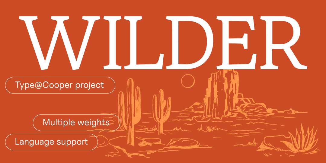
I am also a recent graduate from the Type@Cooper where I developed my first font family, Wilder.
WORK (INDEX)
Graphic Design
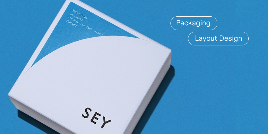
SEY Coffee
How do you design wholesale packaging for a product that is always a limited run? With sustainability as the focus, a reusable evergreen package came to life.
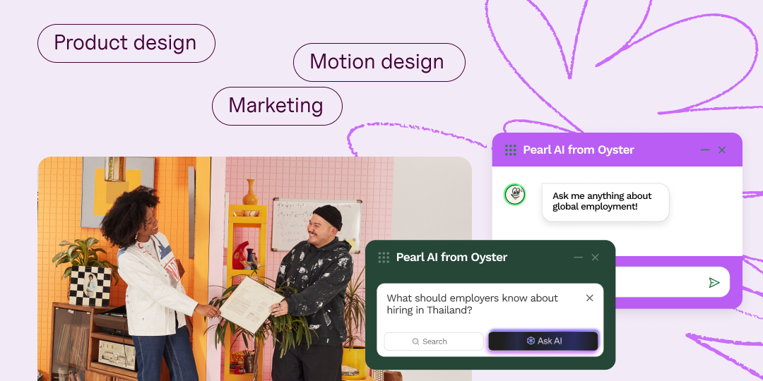
Oyster HR
So, how do we make remote hiring enticing and exciting for the employee and the employer? 300+ motion assets later and that answer is clearer.
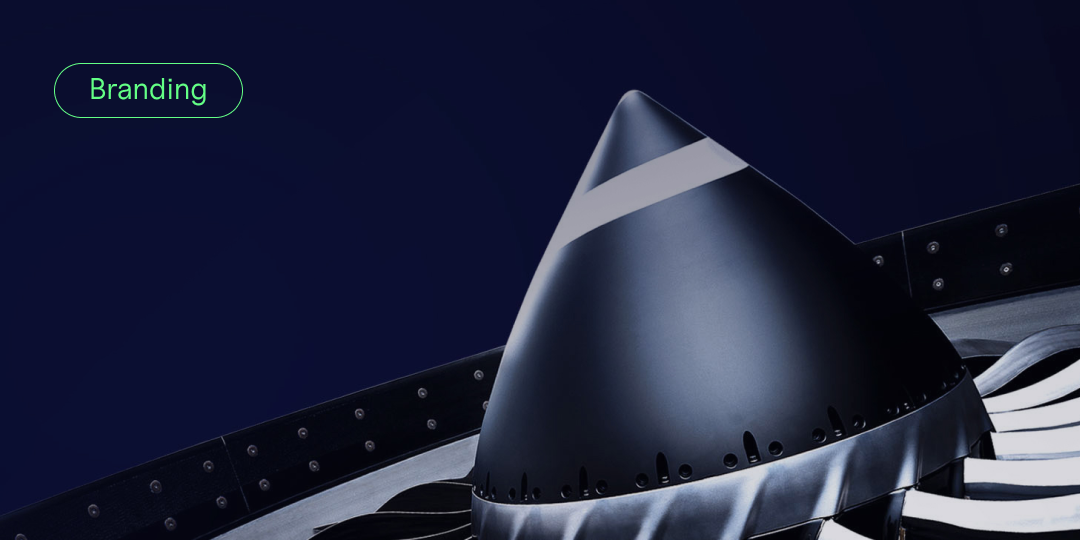
GE Aerospace
After a century of dominance in the aviation field how does GE become a leader again? A full rebrand came to life with this question at the center of it all.
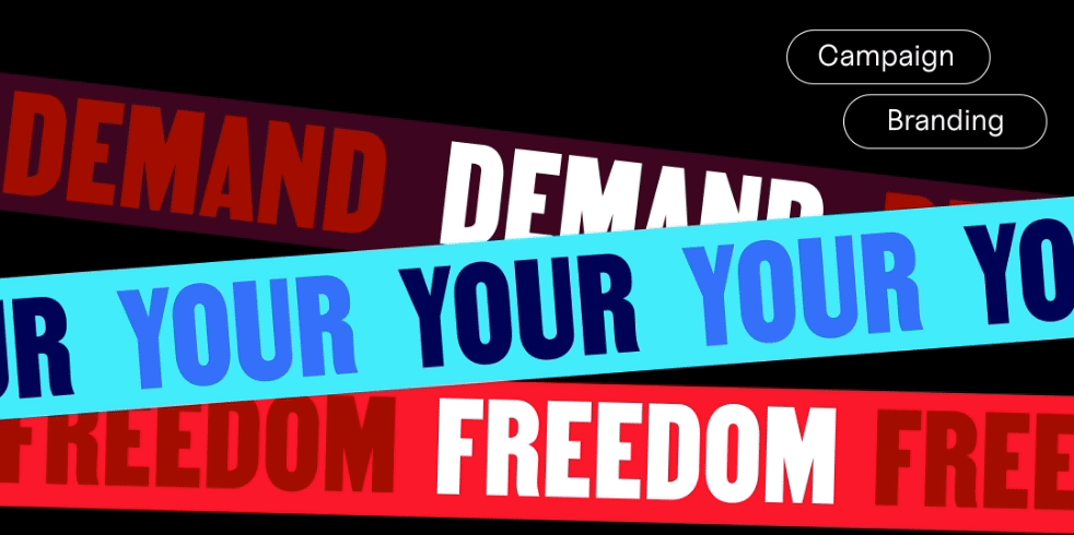
Get Out the Vote
Voting should be personal. This campaign was looking beyond party alignment.
Motion Design
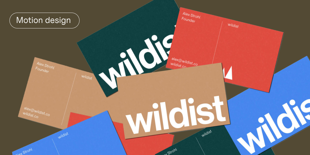
Studio Mast
This is a bit more than just one singular project, it has been years of collaboration in the making.
Their studio creates truly amazing branding and as a final piece to their work, I create motion systems that bring it all to life.
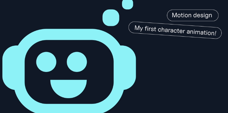
Frontier
As more brands are trying to find relatable ways to connect with their clients, Frontier was looking to make their online chat system more friendly.
Fast forward to a few concepts later, Giga was born and needed a motion approach that really brought the character to life.
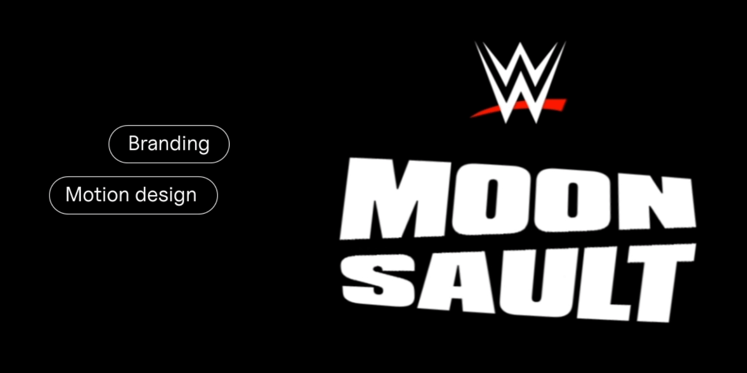
WWE Moonsault
WWE wanted to create a new brand experience for their NFT collection they were launching in 2021. Given that it was a brand that is exclusively online, we developed a kinetic logo.
Type Design
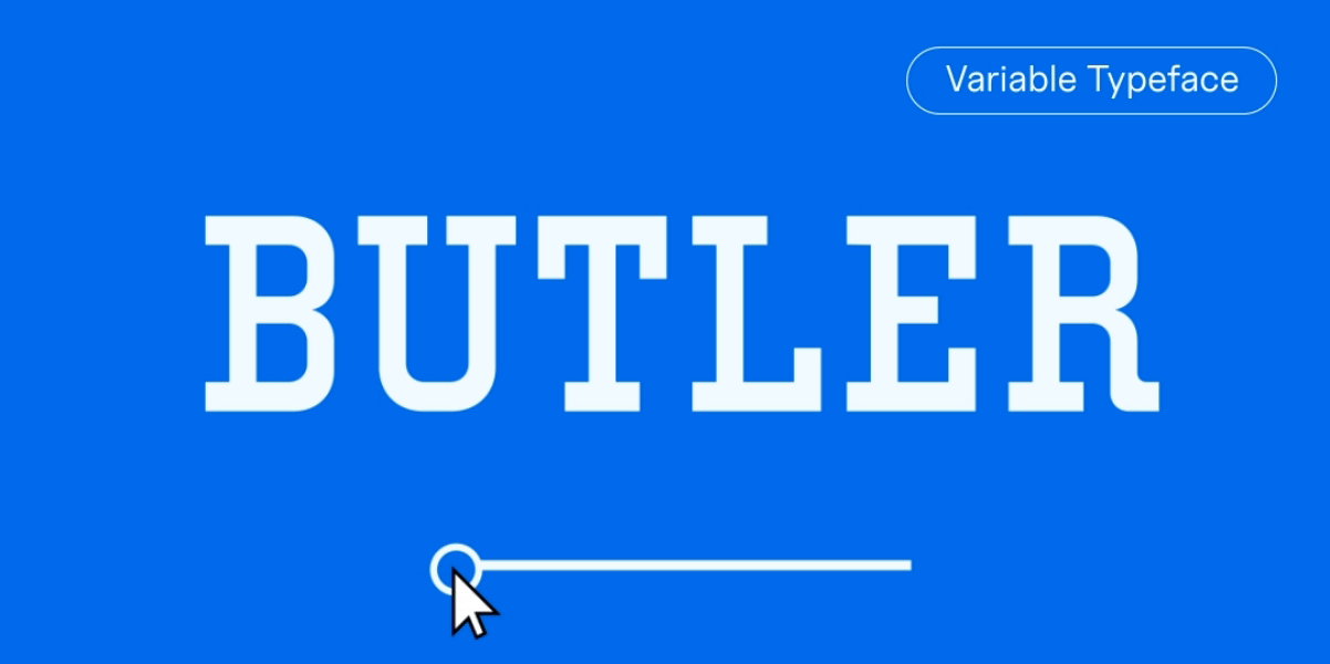
Butler (Variable)
When visiting my dad’s hometown (David City, Nebraska), I discovered that the county fairgrounds had a sign that was created by my grandfather. Upon his passing, I decided to create a typeface that could live beyond the 700 person town.
Wilder (Family)
The assignment requirement was to build out a typeface that works for body copy and small use sizes. It also had to be translation based construction.
From there the assignment was open to interpretation. After research of possible use cases, the idea behind Wilder came to life. It was time to reimagine what the national parks could be (typographically).
FOOTER
Let's be in touch!